
Reducing User Confusion in a Dual-System Experience
Chicago Tool Library (Website + Member Portal)
Client
Chicago Tool Library
Timeframe
July 2025 - Present
Project Type
Freelance Project
Project Overview
The project involved a comprehensive redesign of the Think Dirty mobile application, aimed at enhancing user experience and functionality within the beauty, personal care, and household product information sector. Think Dirty is widely recognized for its capability to inform users about product ingredients via barcode scanning, yet it faced challenges related to usability, data comprehensiveness, and user engagement.
The primary goal was to create a more intuitive and efficient user interface that simplifies the process of understanding product ingredients while expanding the depth of information provided. Key features included redesigning the scanning interface for quicker and more accurate results, improving the clarity and accessibility of ingredient information, and integrating a seamless shopping experience for cleaner alternatives.
Problem
Chicago Tool Library provides access to tools for community members, but the experience is split across a public-facing website and a separate member portal.
Through initial exploration, it became clear that users—especially first-time visitors—may struggle to understand:
what a tool library is
how borrowing works
whether membership is required
where to go to complete key actions
This lack of clarity is compounded by inconsistencies between the website and portal, which creates a fragmented experience and increases cognitive load when navigating between systems.
Insights were informed by a broader needs assessment conducted with the organization. (View full document)
User Pain Points
As stated above, users encounter several pain points when discovering what ingredients are in their beauty, personal care and household products.
Inefficient barcode scanning functionality causes frustration for users.
Limited depth of product information restricts understanding of ingredients.
Absence of seamless shopping options for cleaner alternatives impedes consumer choice.
Approach
To better understand the experience, I focused on identifying usability breakdowns and gaps in the information architecture.
Heuristic Evaluation
I conducted a heuristic review of both the website and the member portal to identify usability issues related to navigation, clarity, and consistency.
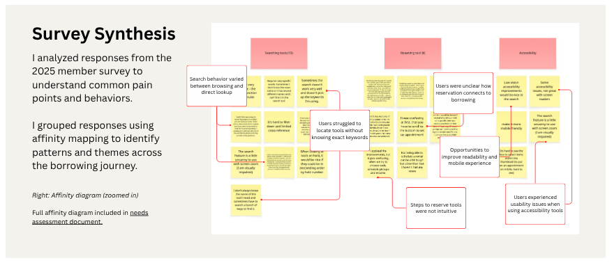
Survey Synthesis
I analyzed responses from the 2025 member survey to understand common pain points and areas of confusion.
Information Architecture Audit
I reviewed the existing sitemap and navigation structure to identify inconsistencies, redundancies, and gaps in how information was organized.
Why this approach?
Given limited access to users and development resources, I prioritized lightweight methods that allowed for efficient identification of usability issues while still grounding decisions in real user feedback.
Key Insights
Findings from the heuristic analysis and survey synthesis were consolidated into a master findings list to identify recurring patterns and prioritize issues. This helped surface high-impact issues related to navigation, terminology, and task flow.
Navigation is inconsistent across the website and member portal, forcing users to relearn structure and creating disorientation
Users struggle to understand how borrowing works, including membership requirements and the steps involved
Terminology (e.g., “Loans,” “Holds,” “C-Tools”) does not match user mental models, increasing confusion
Key actions (borrowing, scheduling, managing tools) are fragmented across pages instead of being grouped by user intent
Dense text, poor hierarchy, and lack of visual structure increase cognitive load and reduce scannability
Design Decisions
Introduced a “Borrow” navigation category
To better align with user goals, I grouped related actions such as tool inventory, account access, and borrowing policies under a single “Borrow” category. This reduces cognitive load and helps users more easily identify where to begin.
Unified navigation across systems
The website and portal previously used different structures and terminology. I aligned these to create a more consistent experience and reduce the need for users to re-learn navigation when switching contexts.
Reframed terminology to match user expectations
Terms such as “holds” were replaced with more familiar language like “waitlist” to better match user mental models and reduce confusion during the borrowing process.
Prioritized onboarding clarity on the homepage
I proposed restructuring the homepage to clearly explain:
what the tool library is
how borrowing works
what is required to get started
This structure groups content based on user intent rather than internal organization.
Outcome
The proposed changes are designed to:
Help first-time users quickly understand how the tool library works
Reduce confusion when transitioning between the website and member portal
Improve navigation clarity and findability of key actions
Support user confidence when exploring borrowing options
Reflection
To further validate these changes, I would conduct usability testing to evaluate whether users can:
Understand how borrowing works within their first visit
Navigate between the website and portal without confusion
Successfully locate and reserve tools
What I learned
This project reinforced the importance of aligning system structure with user mental models, particularly when experiences span multiple platforms.